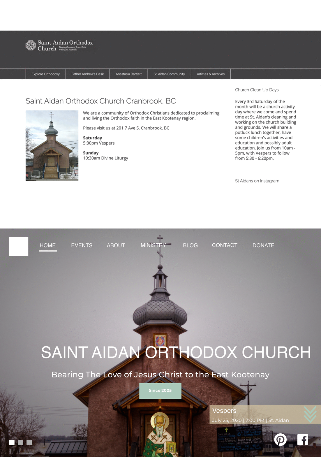
Developing a webpage for Saint Aidan's Orthodox Church
Blog
Click to see Saint Aidan's website.
I felt sad looking at the old Saint Aidan website, l thought this should look better because I make judgments about a place through their website before I even visit it. It also makes you question whether or not the information there is up to date. So being concerned, I approached Fr. Andrew to develop a new webpage for the Parish.
Mind you, this is the second time I would be coding a WordPress template, without having programming job experience in the field, so to me this was also a great learning experience.
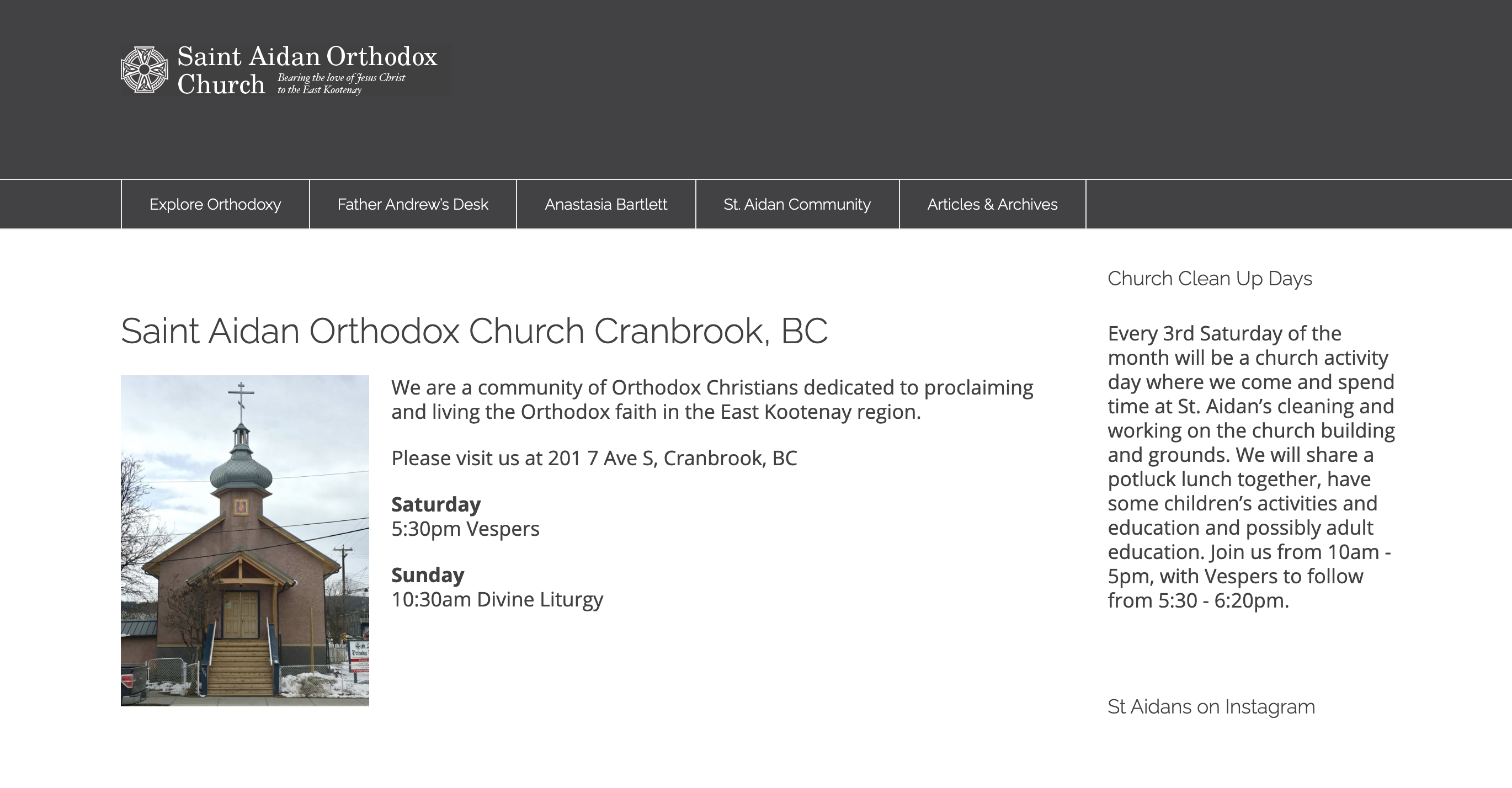
The old webpage (from web.archive.org Aug 28, 2019)
I began doing initial sketches with a pencil and conducting interviews to create personas that could guide me.
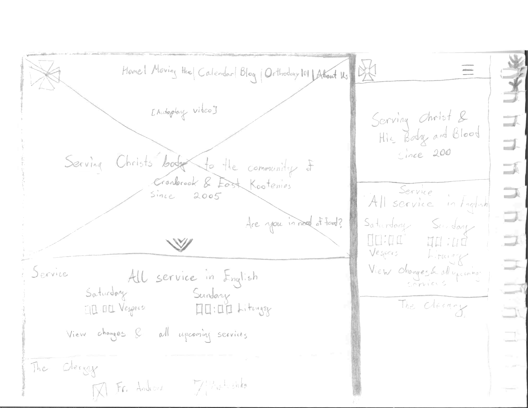
Home page sketch along with mobile sketch up
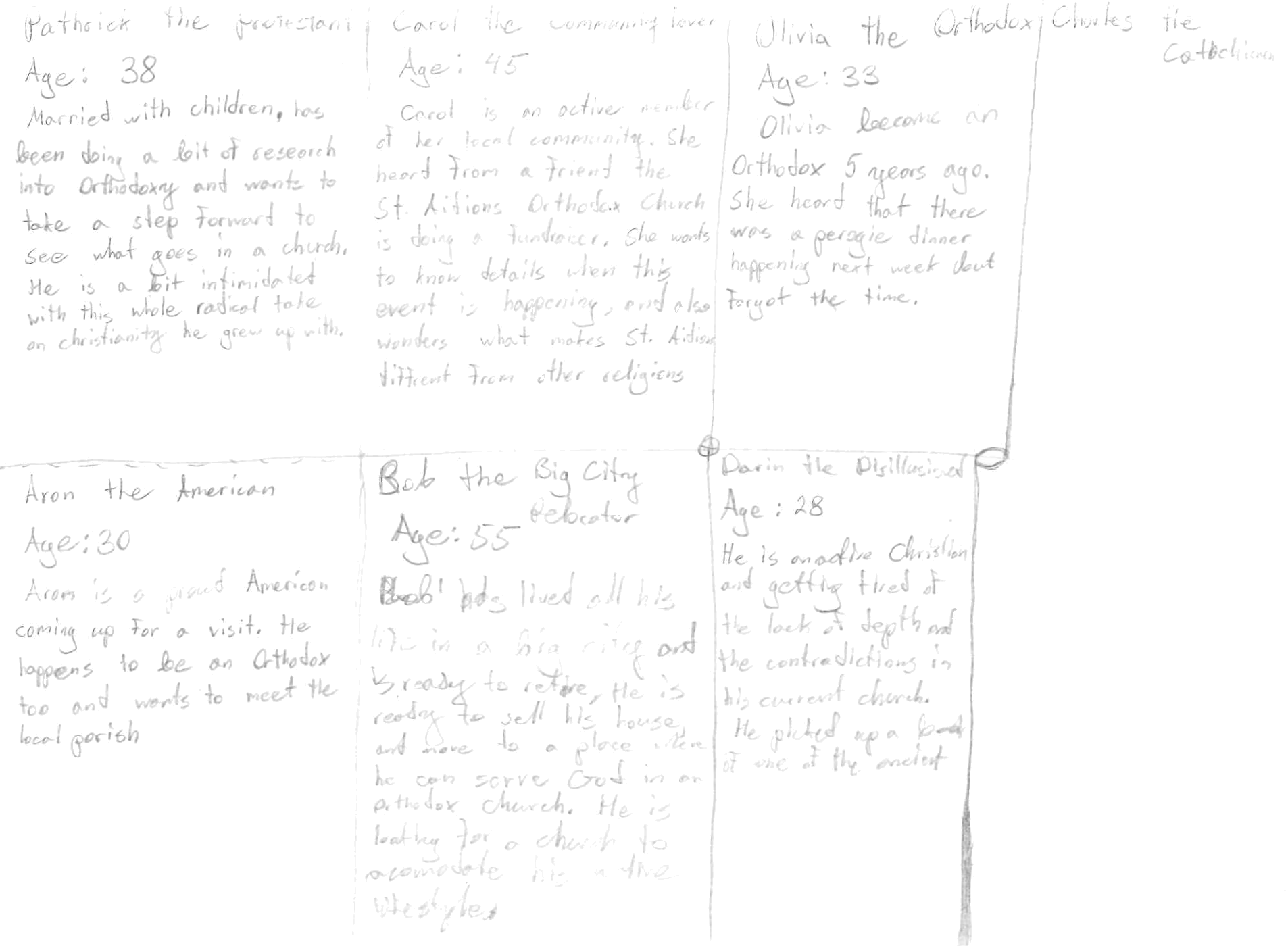
Personas
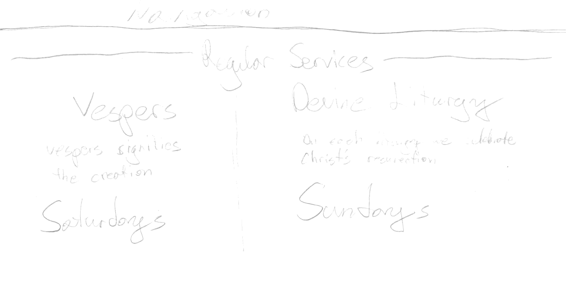
Schedule page sketch
I needed some media assets to make the webpage feel more "home". So I took my handy Alpha 6000 and went to work shooting photos at different aspects of the Church. While most didn't make the final cut, a couple of them stood out:
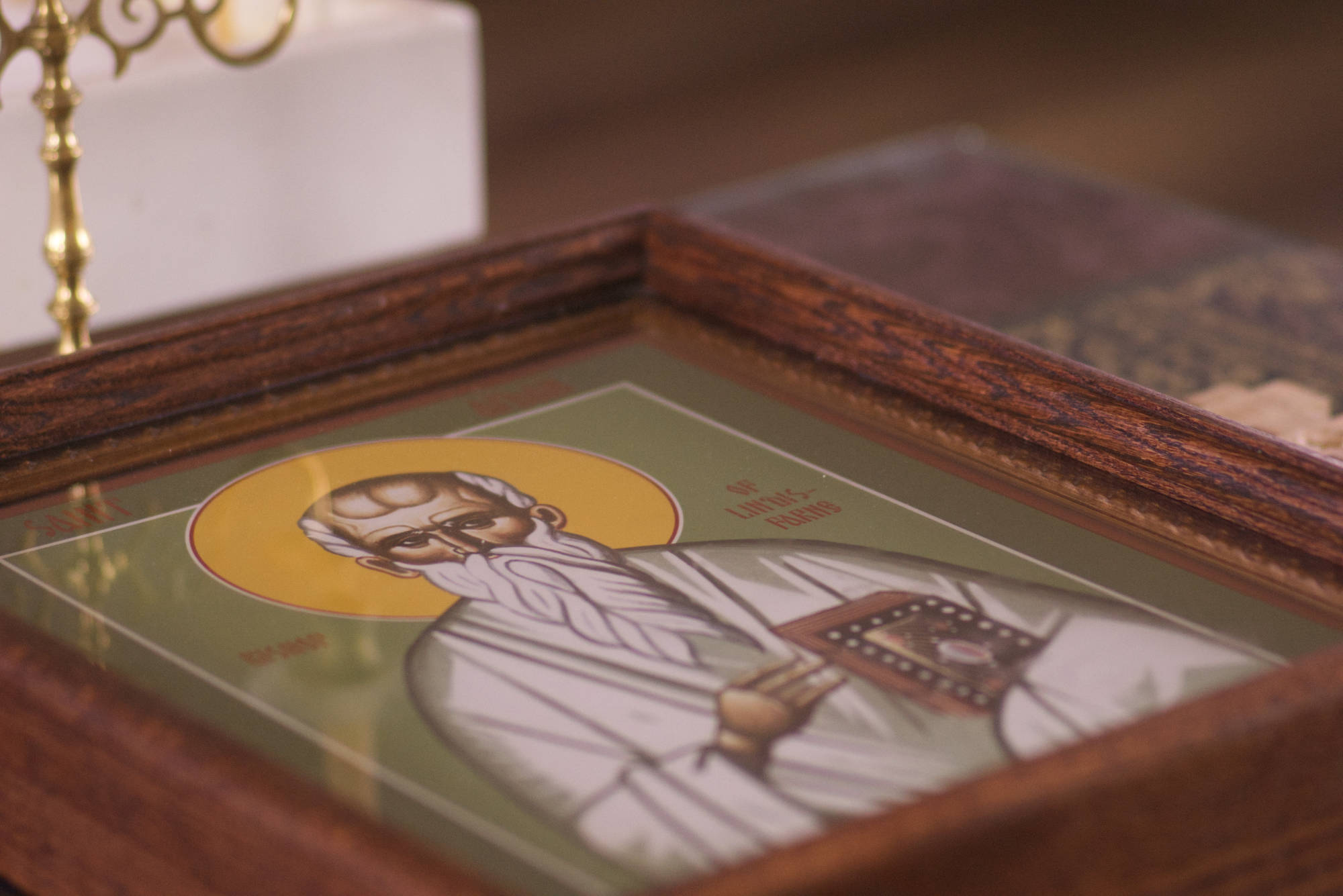
Icon of St. Aidan at Saint Aidan's Church
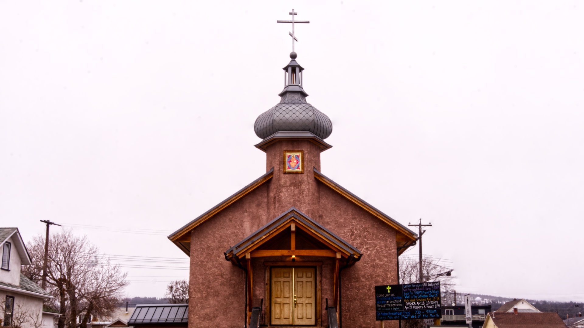
Saint Aidan's Orthodox Church in Cranbrook (needs colour balance but lost original file :( )
To prevent people from having an unhindered experience, I created a staging environment on an AWS Lightsnail server and pointed it to a subdomain. This way the regular website could go on and I could share live development updates with the people involved. With this I generated an underscores base template and got underway.
Now at this point Covid hit and things were uncertain, I had to continue working remotely and so moved from Sparwood back to Calgary, only to soon move again for my next internship to Toronto. These slowed things down but also gave me the chance to learn new tools such as Sketch at my next internship.
Looking at multiple different Saint Aidan icons I wanted to derive a colour scheme for the website. After some trial and choosing the Saint Aidan icon that the church loved, we came to a gold/green scheme.
With Sketch, I gave the initial pencil sketches a bit more flesh and used the colour scheme to make some wireframes:
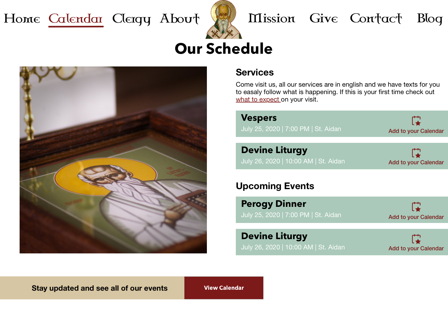
The initial wireframe and first draft
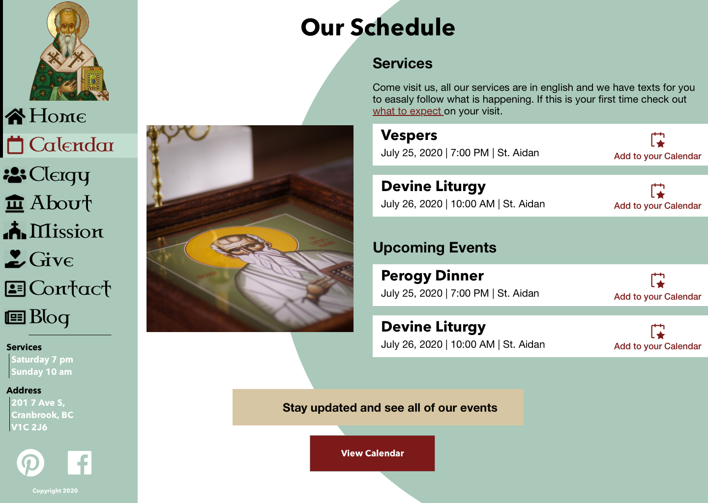
Iteration #2
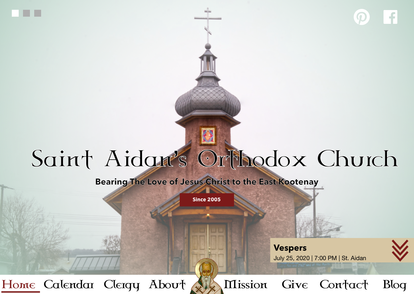
Iteration #3
Looking back on iterations 1 and 2, it can be demotivating designing something, you have this idea to make a fancy modern webpage, only to have some boxy weird designs, but persistence and iterating more are the only remedies I have found, and with iteration 3 things are starting to go in the direction I want.
Finally, we have arrived at our destination:
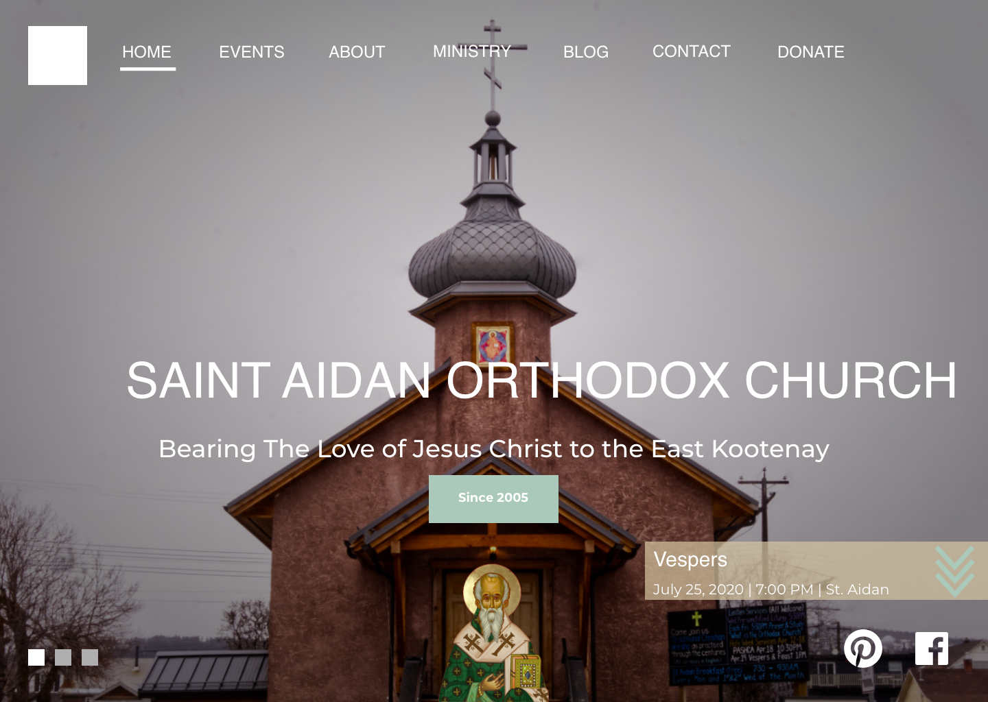
The final iteration - St Aidan floating and slideshow buttons
This set the tone for designing the rest of the webpage, and after getting approved by Fr. Andrew I was happy to make the next sections of the webpage.
As I started working on coding wireframes, things got changed due to technical difficulties, or requirements changing. Attached below are the final designs I had made in Sketch before coding them:
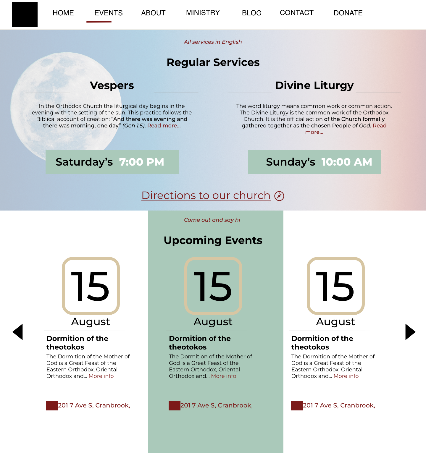
The calendar/schedule page
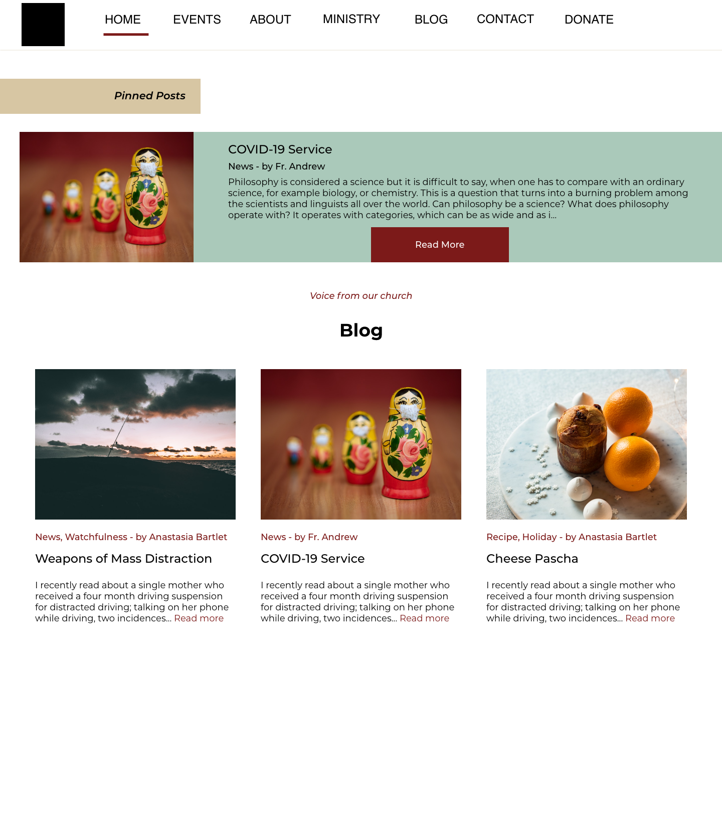
Latest News section
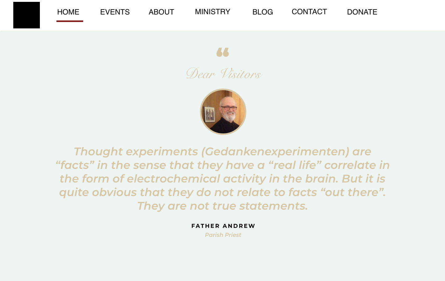
Message from Father
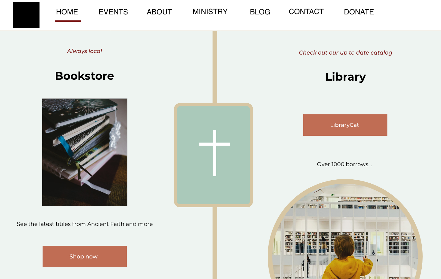
Bookstore and Library links
The webpage is live and it might look different as the development and design is an ongoing process. It keeps on evolving the page with new ideas and additions. Part of me worries that it won't ever be finished, but I also enjoy and am happy to keep on improving this as I believe in the goodness it is bringing to the community.